Because your stakeholder matrix is a key communication tool for gaining buy-in on strategic ESG actions, both internally and externally, Datamaran provides you with several tools to tailor it:
- Chart view options
- Issues view options
- Issues categories-custom-design
Chart view options
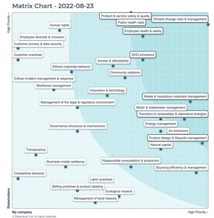
There are two ways to visualize your stakeholder matrix results: Quadrants and Curves. To make the matrix more actionable and to communicate those actions to stakeholders, Datamaran recommends applying the Quadrants view.
The Quadrants view presents the issues in four action areas:

- Develop strategy & communicate externally
This quadrant represents the issues of high importance to your company and your stakeholders. These should be considered priorities from a strategy and communication/reporting standpoint. - Communicate internally
This quadrant represents the issues with higher importance to your stakeholders than to your company. It is important to share this information internally to ensure that relevant issues aren't being under-prioritized, or at least to have a clear rationale as to why they are deemed less important by your company. - Continue internal efforts
This quadrant represents the issues with higher importance to your company than to your stakeholders. Because of the relevance to your business, maintaining focus on these issues is likely important, though they may be less relevant for in-depth communication or reporting. - Keep under observation
This quadrant represents the issues that are of lower importance to your company and your stakeholders. Given the dynamic nature of these issues, it is important to apply an ongoing monitoring approach through Dynamic Analysis to assess any changes in importance that may warrant a more action-oriented approach.
Datamaran also provides the possibility to visualize the matrix results in a more traditional Curves view, for which you can establish the relevance of the issues by tailoring the prioritization areas:
- High priority issues
- Medium priority issues
- Low priority issues
You can switch between the two views by clicking the toggle below the "Hide/Show Labels" option.

Issues view options
You can choose the "View options" button to see all the issue labels on your matrix or only see the issue label when you click the issue point on the matrix.
Issues categories custom-design
Datamaran's "Issue Mapping" editor gives you the option to assign categories to your issues (for example: "Environmental," "Social," and "Governance"; or sort by the location in your value chain where an issue's impact lies), to help you tell a clearer story of what the data in your stakeholder matrix is showing.
You can select the option to show the categories in your matrix to provide more information in one viewing or to hide those categories if you don't want to see them.

Please note that once you have started the monitoring process, you will not be able to change how the results are visualized for that particular analysis. If you want to change the view of an analysis that is being monitored, you can duplicate it to adjust the view.